How to Design Your Own Custom Acrylic Signs: Tips and Ideas
Many people assume designing acrylic signage is as simple as picking a font and printing it on plastic. In reality, poor layout choices, low-contrast colors, or incorrect thickness can result in a sign that looks unbalanced, hard to read, or cheaply made.
If you’re searching for how to design acrylic signs that look professional without hiring a full design agency, this guide explains the process in a practical and realistic way. We’ll cover materials, layout strategy, current trends, cost considerations, and a step-by-step DIY approach.
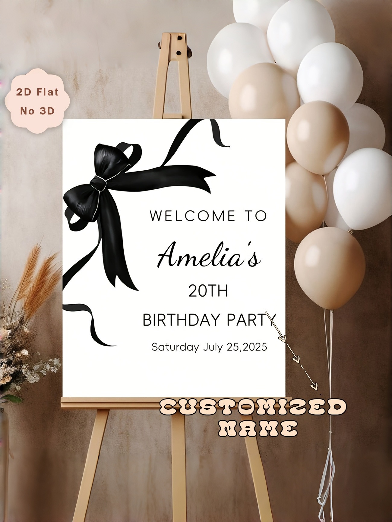
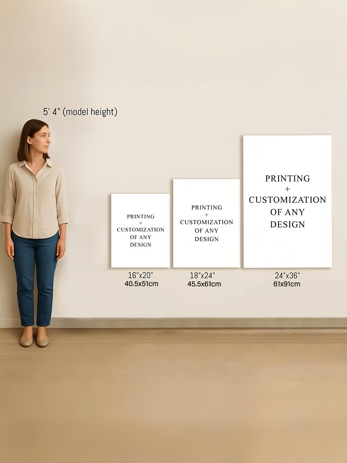
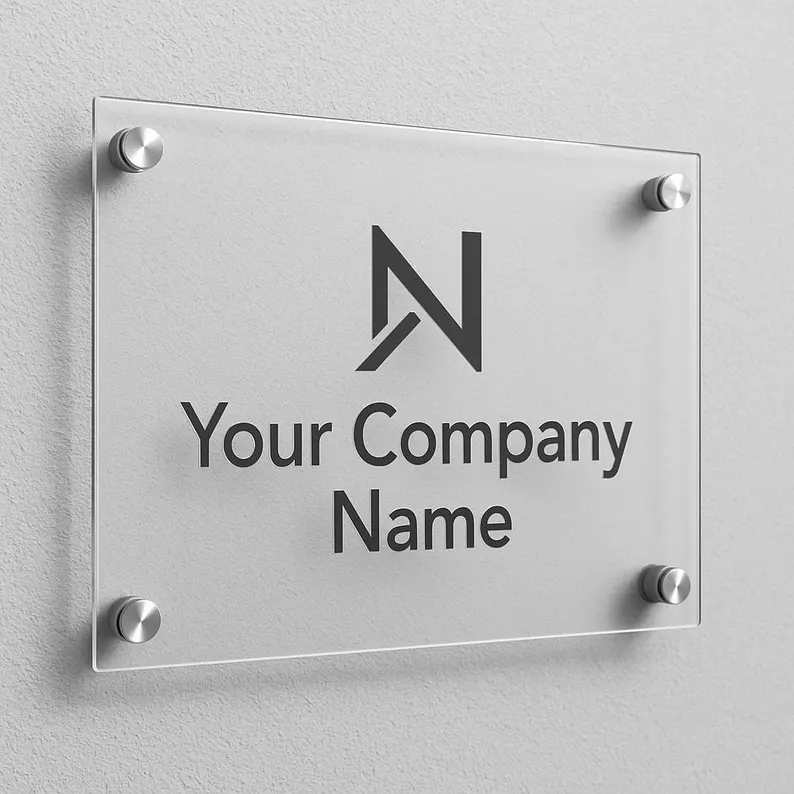
Before starting your design process, it’s helpful to review different types of acrylic signs available on the market. Understanding common sizes, finishes, and mounting styles can give you a clearer reference point before creating your own layout.
What Makes Acrylic a Popular Sign Material?
Acrylic (often called plexiglass) is a lightweight plastic material that visually resembles glass but offers greater impact resistance. It is commonly used for indoor signage and controlled outdoor applications.
Advantages
-
Clean, modern appearance
-
Smooth surface ideal for engraving or UV printing
-
Available in multiple colors, finishes, and thicknesses
-
Lighter and safer than glass
Limitations
-
Scratches more easily than metal
-
May warp in extreme heat
-
Not ideal for harsh weather conditions
-
Glossy finishes can show fingerprints
Understanding these limitations is essential when planning custom acrylic signs design. Acrylic works very well in offices, retail stores, and event settings—but it is not automatically the best material for every environment.
Step 1: Define the Purpose Before Designing
Before selecting fonts or colors, clarify what the sign must accomplish.
Ask yourself:
-
Is this for branding, wayfinding, decoration, or information?
-
Will viewers see it from 2 feet away or 20 feet away?
-
Is it installed indoors or outdoors?
-
Does it require lighting?
One of the most common mistakes in custom acrylic signs design is prioritizing visual style over clarity. A beautiful sign that cannot be read quickly fails its main function.
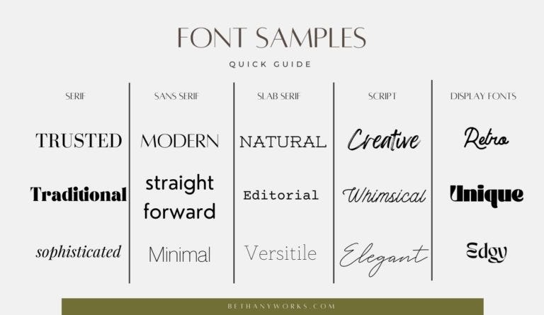
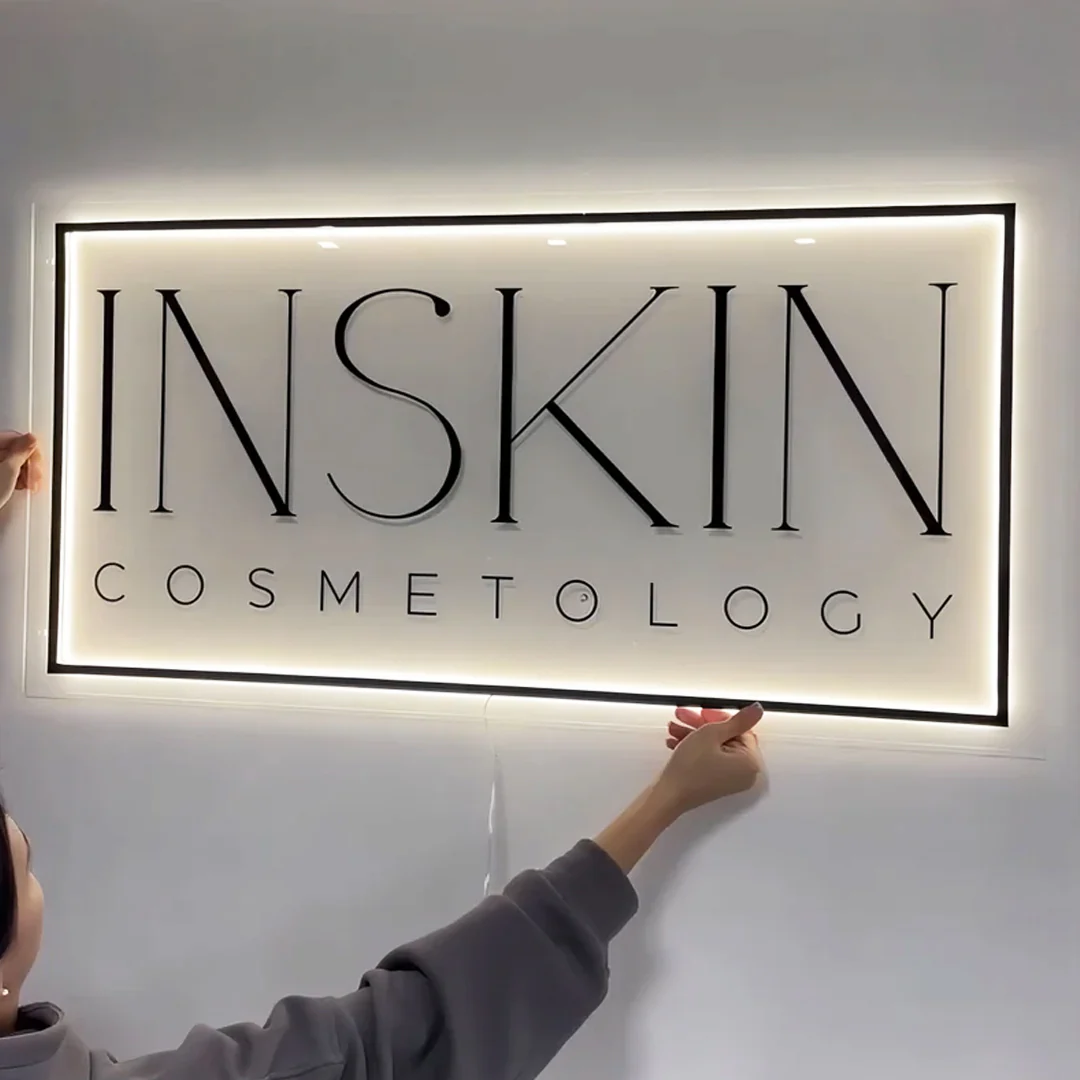
Step 2: Choosing the Right Font
Typography strongly influences how professional your acrylic sign looks.
Keep It Readable
-
Sans-serif fonts work well for modern branding.
-
Serif fonts suit traditional or formal settings.
-
Avoid overly decorative fonts for important information.
Limit Font Pairings
Using more than two fonts often creates visual clutter. Consistency makes signage feel intentional rather than experimental.
Consider Letter Thickness
Thin engraved letters can look elegant, but they may reduce readability at a distance. Slightly thicker strokes often perform better for storefront signage.
Practical Tip: Always print a full-size paper mockup and tape it to the wall before finalizing production.
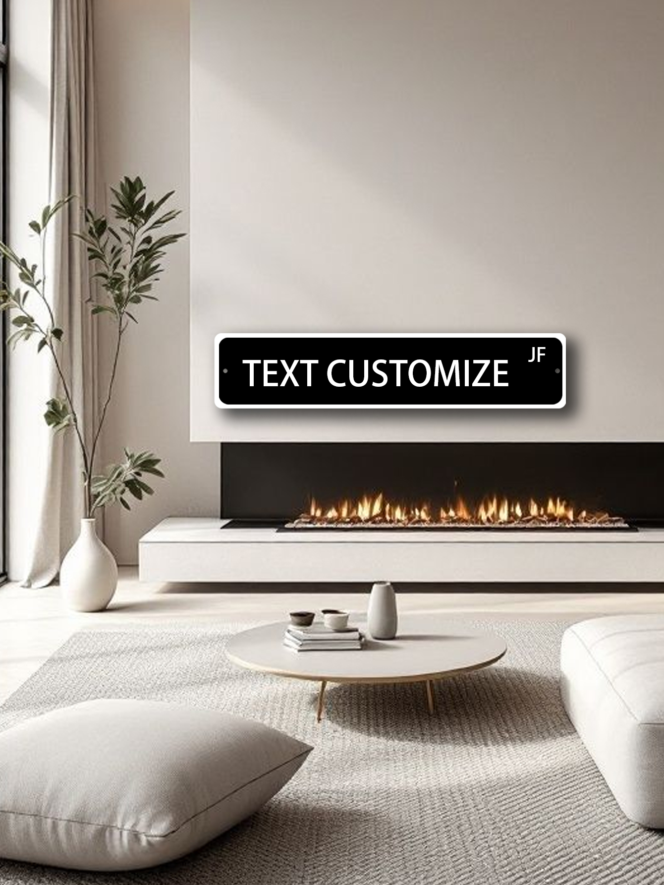
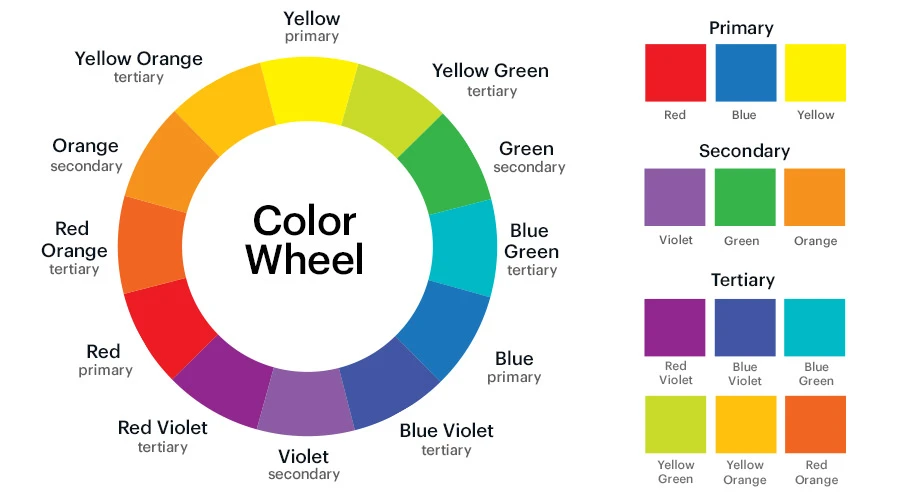
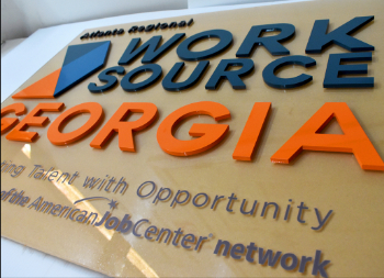
Step 3: Selecting Colors That Match Your Brand
Color decisions affect both visibility and brand perception.
High Contrast Is Essential
Clear acrylic with white lettering may look stylish online, but in real lighting conditions it can appear faint. Ensure strong contrast between text and background.
Follow Brand Guidelines
If designing for a business, remain consistent with official brand colors. Small inconsistencies can weaken visual identity.
Avoid Overusing Trend Colors
Neon tones and bold gradients are currently popular, but trends change quickly. A neutral color palette often ages better.
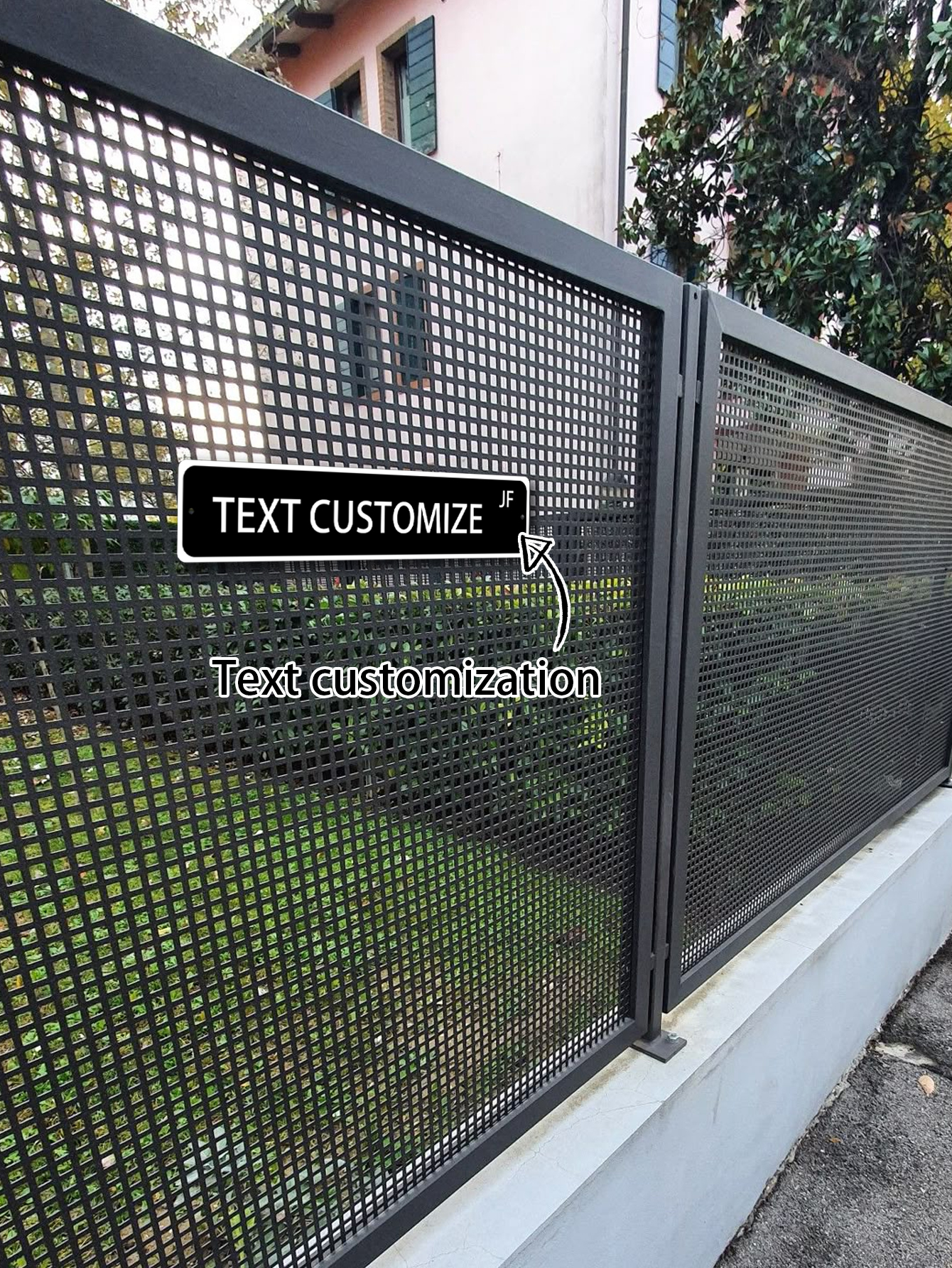
Acrylic signs are not limited to rectangular shapes.
Popular Shape Options
-
Rectangular panels (most practical and cost-effective)
-
Rounded corners
-
Circular or oval shapes
-
Custom die-cut silhouettes
However, custom shapes typically increase production cost and may complicate mounting. If budget efficiency is important, simple shapes are usually more practical.
Use White Space Intentionally
Crowded layouts reduce readability. Leaving generous margins around text improves clarity and creates a more refined appearance.
Popular Design Trends in Acrylic Signs
Design trends influence signage aesthetics, but trends should support function—not replace it.
1. Minimalist Modern Style
Neutral tones, simple typography, and clean layouts dominate corporate environments. This style tends to remain relevant longer than highly decorative approaches.
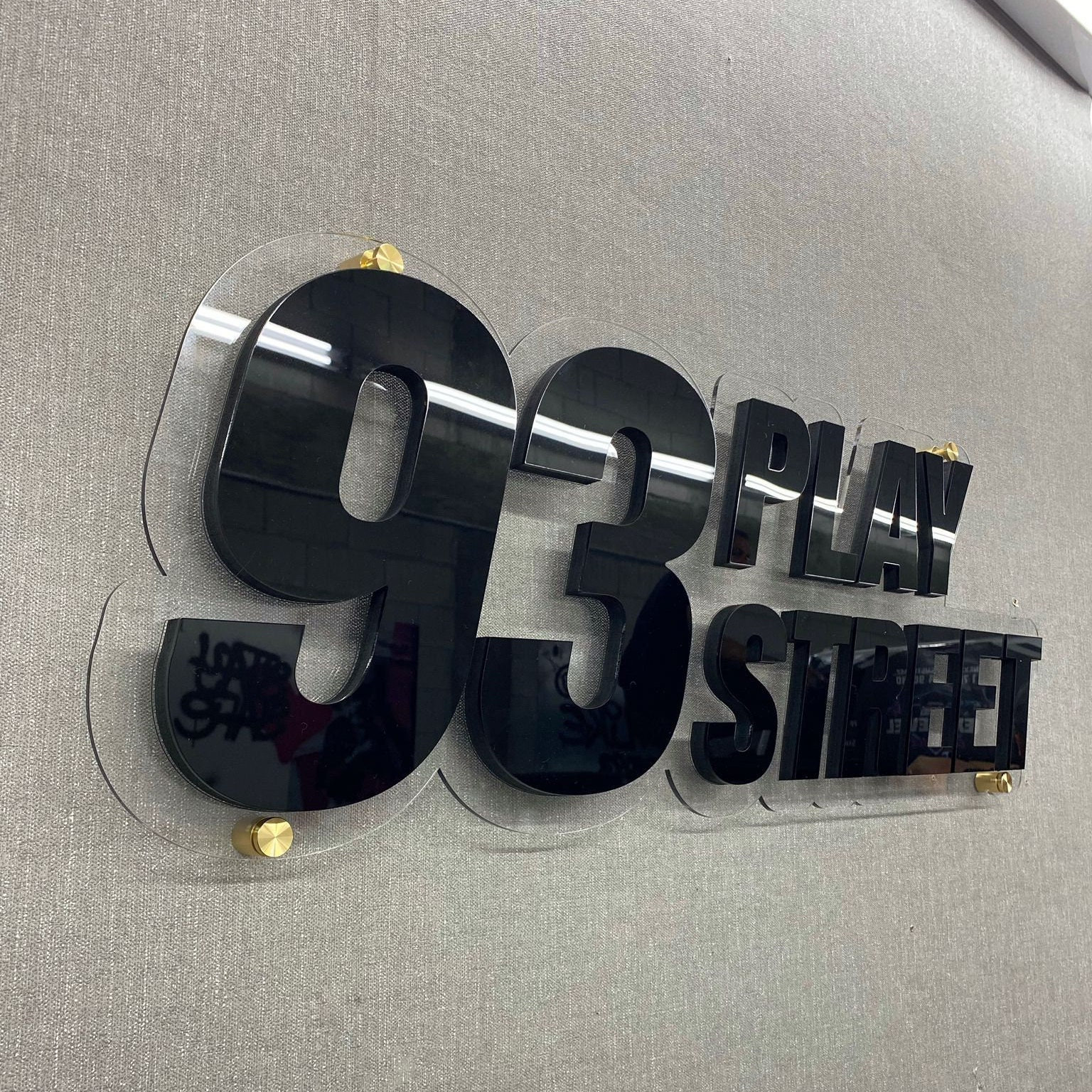
2. 3D Raised Lettering
Layering acrylic panels creates dimensional depth. Raised letters add visual interest but require precise alignment and increase production cost.
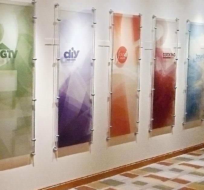
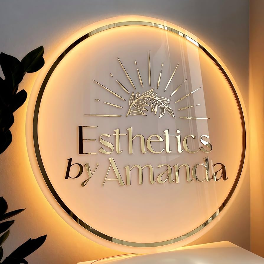
3. Backlit Acrylic Signs
LED backlighting enhances visibility and creates a premium feel.
However:
-
Electrical access is required
-
Installation is more complex
-
Long-term maintenance must be considered
Backlit signs are effective, but not always necessary for smaller indoor applications.
How to Make Acrylic Signs: A Practical DIY Guide
If you are exploring how to make acrylic signs yourself, follow these steps.
Step 1: Create a Digital Layout
Use software such as:
-
Canva
-
Adobe Illustrator
-
CorelDRAW
Ensure measurements match your acrylic sheet dimensions exactly.
Step 2: Select Acrylic Type and Thickness
Common options include:
-
Clear acrylic
-
Frosted acrylic
-
Colored acrylic
-
Mirrored acrylic
Thickness usually ranges from 3mm to 10mm.
For small indoor signs, 3–5mm is often sufficient. Larger wall signs typically require 6mm or thicker for rigidity.
Step 3: Apply the Design
Methods include:
-
Vinyl lettering
-
Laser engraving
-
UV printing
DIY vinyl is more affordable but alignment errors are common. Professional UV printing produces sharper results and better durability.
Step 4: Mounting Considerations
Mounting options:
-
Metal standoffs
-
Adhesive backing
-
Suspended cable systems
Standoff mounting generally creates a cleaner, more professional look.
How Much Does It Cost to Design Acrylic Signs?
Cost varies depending on size, thickness, and printing method.
Approximate considerations:
-
Small DIY sign: relatively affordable
-
Professional UV printed sign: higher cost
-
3D or backlit sign: significantly higher investment
DIY may save money initially, but mistakes in measurement or alignment can lead to wasted materials. Professional production reduces risk but increases upfront expense.
Indoor vs Outdoor Considerations
Acrylic performs best indoors or in protected outdoor areas.
For outdoor use:
-
Choose UV-resistant acrylic
-
Increase thickness
-
Avoid prolonged direct sun exposure
Even with precautions, acrylic may not last as long as metal or composite materials in extreme weather.
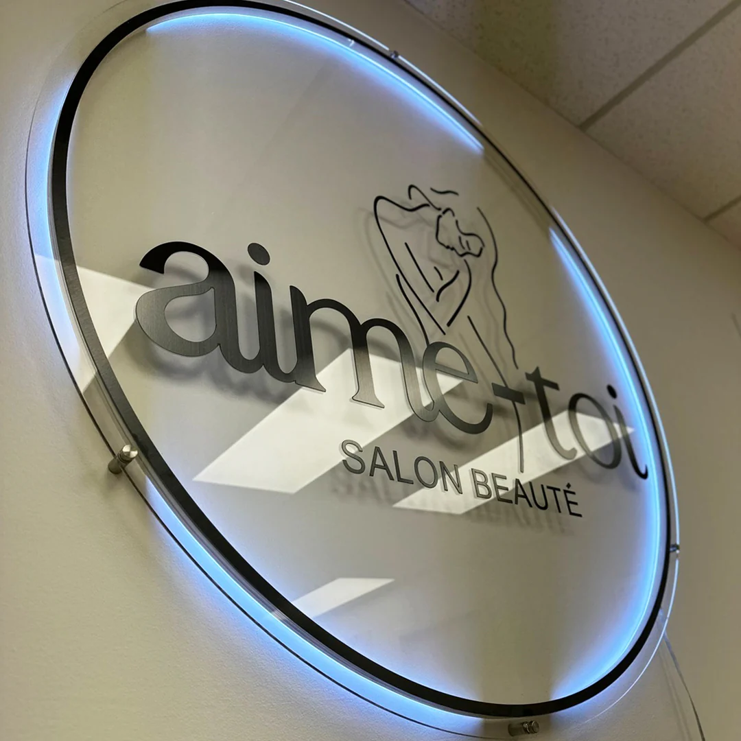
Real-World Design Observation
In one office signage project, both frosted and clear acrylic were tested. While clear acrylic appeared more modern, overhead lighting caused noticeable glare. Frosted acrylic reduced reflections and improved readability.
This highlights an important lesson: aesthetic appeal does not always equal functional performance.
Common Mistakes to Avoid
-
Overcomplicating the layout
-
Choosing low-contrast color combinations
-
Ignoring mounting logistics
-
Selecting acrylic that is too thin for large signs
-
Skipping full-size mockups
Many design issues only become obvious after installation. Testing beforehand prevents costly revisions.
Final Thoughts
Designing your own acrylic signage is entirely achievable with proper planning. By understanding materials, typography, contrast, cost, and installation logistics, you can create a sign that looks professional and performs effectively.
Whether you are researching how to make acrylic signs at home or refining your custom acrylic signs design strategy for a business, thoughtful preparation will save time, money, and frustration.
Acrylic signage offers flexibility and modern appeal—but like any material, it delivers the best results when used in the right context.
Frequently Asked Questions About Acrylic Sign Design
What thickness is best for acrylic signs?
For indoor wall signs under 24 inches, 3–5mm is usually sufficient. Larger signs benefit from 6mm or thicker material.
Are acrylic signs suitable for outdoor use?
Yes, but only in controlled conditions. Extreme weather may reduce lifespan compared to metal signage.
Is it cheaper to make acrylic signs yourself?
DIY can reduce labor cost, but mistakes in alignment or cutting can offset savings.
What is the most durable printing method?
UV printing generally offers better durability than vinyl for long-term use.
My Perspective on Custom Acrylic Signs Design
The strongest acrylic signs are not necessarily the most decorative. They are the most intentional.
A balanced approach prioritizes:
-
Function
-
Clarity
-
Aesthetics
Trends change quickly. Clear communication does not.